P

資料統計
總安裝量
302
近 24 小時
+1
使用者評分
-
描述
版本13
評分0
權限說明
一个轻量级可拖拽的弹窗组件库,支持主题切换。
Popup 使用说明文档
一个轻量级、可拖拽、支持主题切换、无遮罩层的弹窗组件库。
✨ 特性
- 🎨 双主题支持:内置亮色/暗色主题,支持 CSS 变量自定义
- 🖱️ 可拖拽:默认可通过标题栏拖动弹窗位置
- 📐 智能边界约束:可配置弹窗与视窗边缘的最小距离
- 🎯 灵活内容:支持字符串、DOM 节点或函数动态生成内容
- 📦 零依赖:纯原生 JavaScript 实现
- ♿ 无障碍:包含基本 ARIA 属性
- 🪶 轻量级:核心代码不到 10KB
📦 安装
直接引入 popup.js 文件:
<script src="./popup.js"></script>
或复制源码到项目中使用。
🚀 快速开始
基础用法
// 创建一个简单弹窗
const popup = new Popup({
  title: '提示',
  content: '<p>这是一个简单的弹窗</p>',
  width: 400,
  height: 200
});

popup.open();
完整示例
const popup = new Popup({
  className: 'popup',        // 自定义类名前缀
  theme: 'light',            // 主题:'light' | 'dark'
  title: '编辑内容',
  width: 460,
  height: 280,
  center: true,              // 初始居中显示
  draggable: true,           // 可拖拽
  edgePadding: 16,           // 边距限制
  content: '<div>自定义内容</div>'
});

popup.open();
⚙️ 配置选项
构造函数参数 options
| 参数 | 类型 | 默认值 | 说明 |
|---|---|---|---|
className |
string |
'popup' |
组件的 CSS 类名前缀 |
theme |
`'light' | 'dark'` | 'light' |
title |
string |
'' |
弹窗标题 |
content |
`string | Node | Function` |
width |
number |
undefined |
初始宽度(px) |
height |
number |
undefined |
初始高度(px) |
center |
boolean |
true |
是否初始居中 |
draggable |
boolean |
true |
是否可拖拽 |
edgePadding |
`number | object` | 16 |
content 参数说明
支持三种类型:
1. 字符串(HTML)
content: '<p>这是 <strong>HTML</strong> 内容</p>'
2. DOM 节点
const div = document.createElement('div');
div.textContent = '这是 DOM 节点';
content: div
3. 函数(推荐:动态生成复杂内容)
content: () => {
  const wrap = document.createElement('div');

  const input = document.createElement('input');
  input.placeholder = '请输入...';

  const btn = document.createElement('button');
  btn.textContent = '提交';
  btn.onclick = () => {
    console.log(input.value);
    popup.close();
  };

  wrap.appendChild(input);
  wrap.appendChild(btn);
  return wrap;
}
edgePadding 参数说明
控制弹窗与视窗边缘的最小距离:
统一值(四边相同)
edgePadding: 16 // 上右下左都是 16px
独立配置
edgePadding: {
  top: 60,
  right: 20,
  bottom: 40,
  left: 20
}
📖 API 方法
popup.open()
显示弹窗。
popup.open();
popup.close()
隐藏弹窗(不销毁 DOM)。
popup.close();
popup.destroy()
完全销毁弹窗,移除 DOM 和事件监听器。
popup.destroy();
popup.center()
将弹窗居中显示。
popup.center();
popup.setContent(content)
动态更新弹窗内容。
参数: 同构造函数的 content 选项
popup.setContent('<p>新的内容</p>');

// 或使用函数
popup.setContent(() => {
  const p = document.createElement('p');
  p.textContent = '动态生成的内容';
  return p;
});
popup.setTitle(title)
更新弹窗标题。
popup.setTitle('新标题');
popup.setTheme(theme)
切换主题。
参数: 'light' | 'dark'
popup.setTheme('dark');
popup.getTheme()
获取当前主题。
返回: 'light' | 'dark'
const currentTheme = popup.getTheme();
console.log(currentTheme); // 'light' 或 'dark'
popup.setEdgePadding(padding)
动态调整边界限制。
参数: number | { top?, right?, bottom?, left? }
// 设置为 8px
popup.setEdgePadding(8);

// 独立配置
popup.setEdgePadding({
  top: 60,
  right: 20,
  bottom: 40,
  left: 20
});
🎨 样式自定义
使用 CSS 变量覆盖
组件使用 CSS 变量,可通过全局或局部样式覆盖:
/* 自定义亮色主题 */
.popup-light {
  --popup-bg: #f0f0f0;
  --popup-fg: #333;
  --popup-border: rgba(0, 0, 0, 0.2);
  --popup-muted: #666;
  --popup-close-hover-bg: rgba(0, 0, 0, 0.1);
}

/* 自定义暗色主题 */
.popup-dark {
  --popup-bg: #1a1a1a;
  --popup-fg: #e0e0e0;
  --popup-border: rgba(255, 255, 255, 0.2);
  --popup-muted: #aaa;
  --popup-close-hover-bg: rgba(255, 255, 255, 0.15);
}
自定义类名
如果担心类名冲突,可使用自定义 className:
const popup = new Popup({
  className: 'my-dialog',  // 类名前缀变为 'my-dialog'
  theme: 'light'
});
对应的 CSS 变量名也会变为 --my-dialog-bg、--my-dialog-fg 等。
💡 完整使用示例
示例 1:表单弹窗
const formPopup = new Popup({
  title: '用户注册',
  width: 400,
  content: () => {
    const form = document.createElement('form');
    form.innerHTML = `
      <div style="margin-bottom: 12px;">
        <label>用户名:</label><br>
        <input type="text" name="username" style="width: 100%; padding: 8px;">
      </div>
      <div style="margin-bottom: 12px;">
        <label>密码:</label><br>
        <input type="password" name="password" style="width: 100%; padding: 8px;">
      </div>
      <div style="text-align: right;">
        <button type="submit" style="padding: 8px 16px;">提交</button>
      </div>
    `;

    form.onsubmit = (e) => {
      e.preventDefault();
      const data = new FormData(form);
      console.log('提交数据:', Object.fromEntries(data));
      formPopup.close();
    };

    return form;
  }
});

formPopup.open();
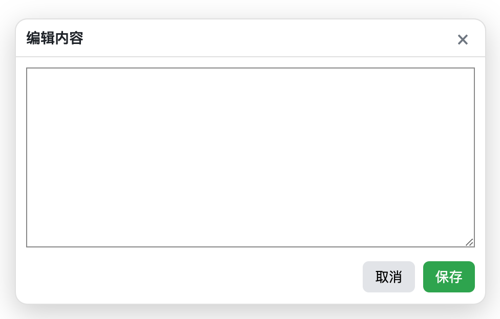
示例 2:富文本编辑器弹窗
const editorPopup = new Popup({
  title: '编辑内容',
  theme: 'dark',
  width: 600,
  height: 400,
  content: () => {
    const wrap = document.createElement('div');

    const textarea = document.createElement('textarea');
    textarea.style.width = '100%';
    textarea.style.height = '280px';
    textarea.style.padding = '8px';
    textarea.style.backgroundColor = '#222';
    textarea.style.color = '#fff';
    textarea.style.border = '1px solid #444';
    textarea.value = '在这里输入内容...';

    const actions = document.createElement('div');
    actions.style.marginTop = '12px';
    actions.style.textAlign = 'right';

    const btnSave = document.createElement('button');
    btnSave.textContent = '保存';
    btnSave.style.padding = '8px 16px';
    btnSave.style.marginRight = '8px';
    btnSave.onclick = () => {
      console.log('保存内容:', textarea.value);
      editorPopup.close();
    };

    const btnCancel = document.createElement('button');
    btnCancel.textContent = '取消';
    btnCancel.style.padding = '8px 16px';
    btnCancel.onclick = () => editorPopup.close();

    actions.appendChild(btnSave);
    actions.appendChild(btnCancel);

    wrap.appendChild(textarea);
    wrap.appendChild(actions);
    return wrap;
  }
});

editorPopup.open();
示例 3:主题切换
const popup = new Popup({
  title: '设置',
  content: '这是一个可切换主题的弹窗'
});

// 动态切换主题
document.getElementById('btnToggleTheme').addEventListener('click', () => {
  const current = popup.getTheme();
  popup.setTheme(current === 'light' ? 'dark' : 'light');
});
🔧 高级技巧
1. 禁用拖拽
const popup = new Popup({
  draggable: false,
  title: '不可拖动的弹窗'
});
2. 限制弹窗可拖动范围
const popup = new Popup({
  edgePadding: {
    top: 80,    // 顶部至少 80px(避开导航栏)
    right: 20,
    bottom: 20,
    left: 20
  }
});
3. 响应式调整
// 监听窗口大小变化,自动调整弹窗位置
window.addEventListener('resize', () => {
  popup.center();
});
4. 多弹窗管理
const popups = [];

function createPopup(title) {
  const popup = new Popup({ title });
  popups.push(popup);
  popup.open();
  return popup;
}

function closeAll() {
  popups.forEach(p => p.close());
}

function destroyAll() {
  popups.forEach(p => p.destroy());
  popups.length = 0;
}
🐛 常见问题
Q: 如何修改关闭按钮样式?
使用 CSS 覆盖 .popup__close 类:
.popup__close {
  font-size: 24px !important;
  color: red !important;
}
Q: 如何禁用点击关闭按钮时的关闭行为?
需要修改源码,或在 content 函数中自行管理关闭逻辑。
Q: 弹窗内容过多时如何滚动?
弹窗 body 部分(.popup__body)默认 overflow: auto,内容超出会自动出现滚动条。
Q: 如何实现点击外部关闭?
当前版本无遮罩层,不支持。如需此功能,需自行扩展或添加遮罩层逻辑。
📄 许可证
MIT License - 可自由使用、修改和分发。
享受使用 Popup 组件! 🎉